Monzo — Overdrafts overhaul
Monzo is a leading UK challenger bank, with an overdraft our customers know as transparent and easy to understand. We were faced with a challenge - due to new regulation, we had to change the fundamental overdraft offering at Monzo, and move our customers to a new model - while balancing business needs and making sure our customers still received a great product.
Product design lead
Motion
Research
The problem
The FCA (Financial conduct authority) implemented new rules for overdrafts to make it easier to compare rates between all UK banks and to make overdraft charges fairer on the customer. In simplest terms, we had to change our pricing model from an easy to understand fixed fee of 50p a day, to a more complicated interest based model (% APR), this required massive changes to our product and preperation for our customers who relied on their overdraft.
The goals
Overdraft charges are already anxiety causing for some customers, keeping this in mind we needed to make sure:
That our customers had enough warning about the change, so they could turn off their overdraft if they didn't agree with the new pricing, and also so we were compliant with the new rules
That we balanced our messaging and execution so that users could clearly understand the new charges, showcasing that it could be better or worse for you depending how you use your overdraft
Being transparent over fees
Lettings customers know we now have higher limits to cater for customers who may need to borrow more on the new pricing
An understandable solution that did not increase customer queries or lose customers who needed their overdraft
Initial Research
The FCA had already done some great customer research into how customers felt about overdrafts across other UK banks, I collated the information to help shape how we could initially tackle this problem, the key themes were:
🔍
Awareness and feelings around overdrafts
Few people had engaged with the cost of their overdraft
Some see overdrafts as an extension of their account, not as borrowing
Few people are reluctant to engage with messages out of anxiety
What can we do?
Make sure it's clear what the cost is, without causing anxiety
📣
Communication regarding their overdraft
People expect bad news and ‘switch off’ when messaged about overdrafts
Language isn't clear and understandable
A desire for more personal information tailored towards them
What can we do?
Make sure our communication is clear and has a good entry point
💰
Understanding the cost of an overdraft
Charges are complex, difficult to understand
Surprised to learn it's different between providers
A desire to just know ‘How much will it cost me to use my overdraft?’
What can we do?
Make it easy for customers to understand their usage
First prototypes and experiments
We launched various experiments to see which entry points performed the best, which flows had the least drop off so that customers were able to get all the information they needed while also having the option to migrate to the new pricing if they wanted. We also did some concept testing with staff initially as we couldn't publicly announce the new APR % pricing yet
The solution

The winning flow
After experimenting with different options, this flow had the least drop off, due to only showing the key information, and educating customers through interactions rather than lengthy words

Understanding the cost of an overdraft
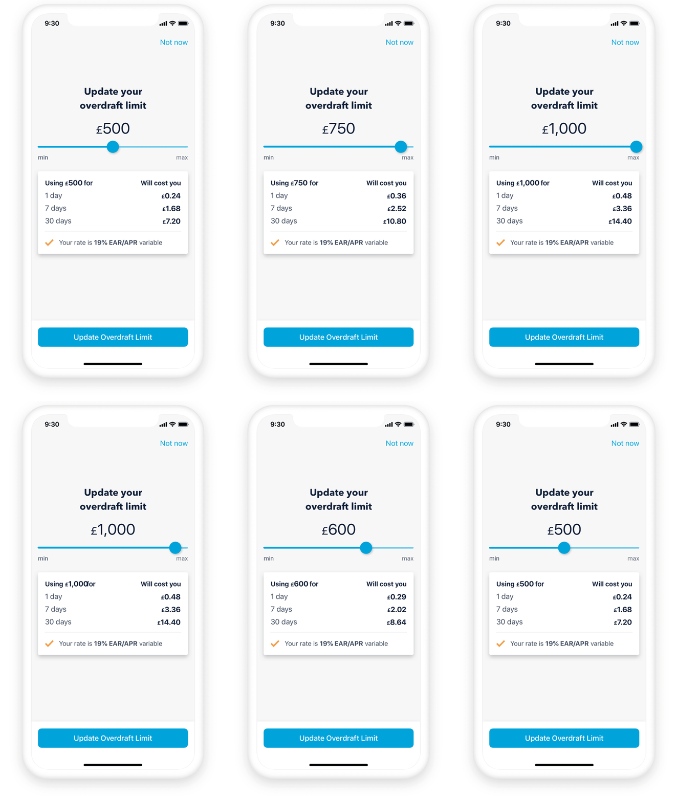
Customers could always see the cost of their total overdraft before commiting to a limit with an interactive slider

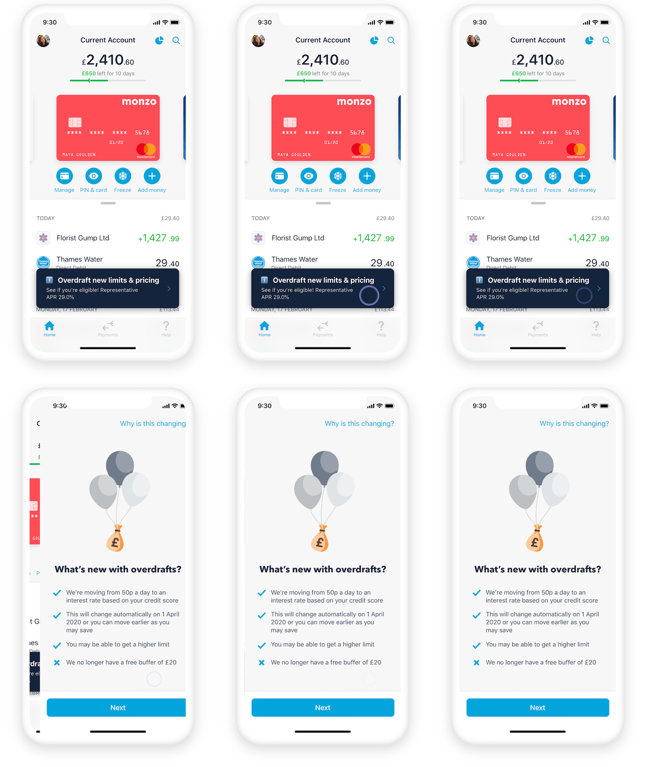
Making sure our communication is clear with a good entry point
This was a huge change so we tested various entry points with different loudlness levels to see which had the best tap through rate

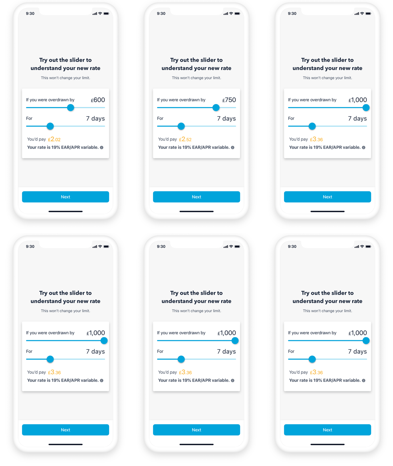
Understanding how usage works on the new pricing
Through usibility testing we found that introducing this double slider was key in getting customers to understand how the new interest rate pricing worked over time