Airtasker — Better browsing
Our browse tasks page hadn’t been redesigned in 3 years, we were updating other aspects of the site and decided to use this opportunity to research what was important to our Taskers when they searched for work.
User research
UI design
Our goal
Find what was important to our Taskers - help them quickly find tasks relevant to them
Include new badging tasks - make it clear there are requirements for these tasks
Research
How did our Taskers look for work?
What was important to them while browsing?
Were there any pain points, was anything missing?
Findings after testing
Amount of offers would play a role in whether they would offer on a task, but not comments
Often wished they could see the due date to quickly organise calendar
Happy to scroll through the feed, fear of missing out on a good task was high
Old UI
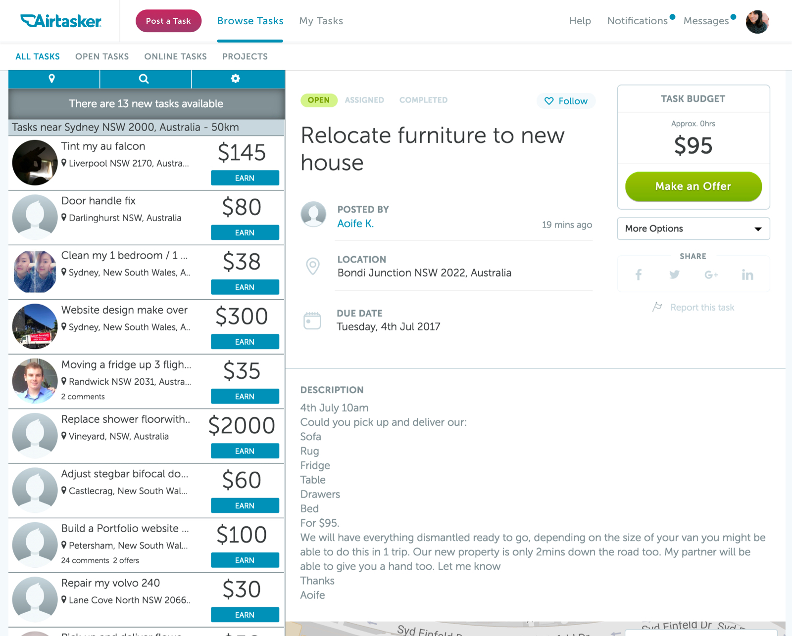
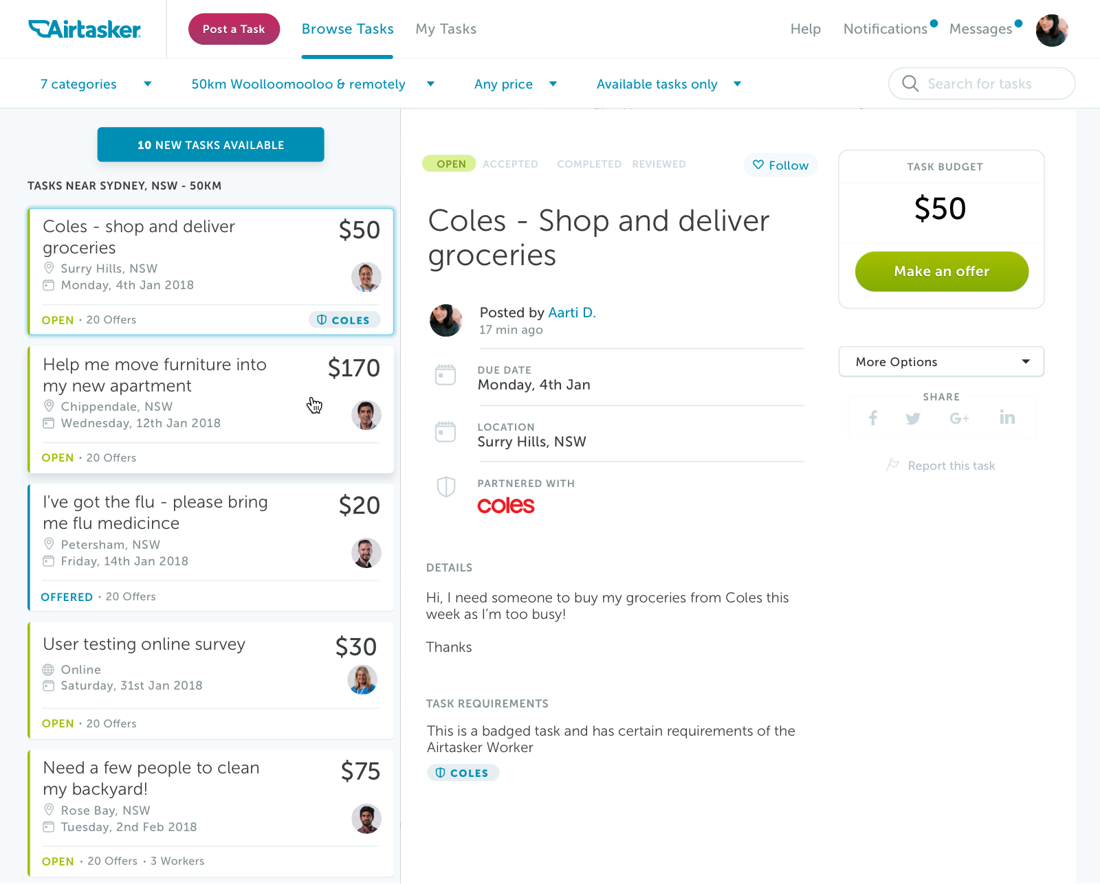
New browse tasks cards
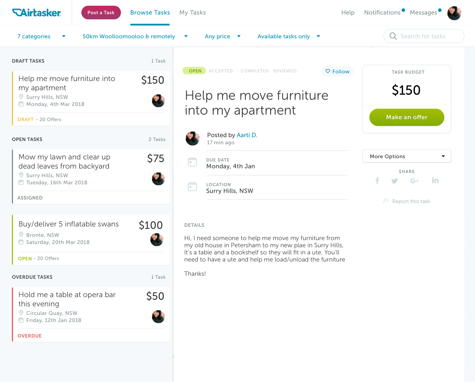
New my tasks cards
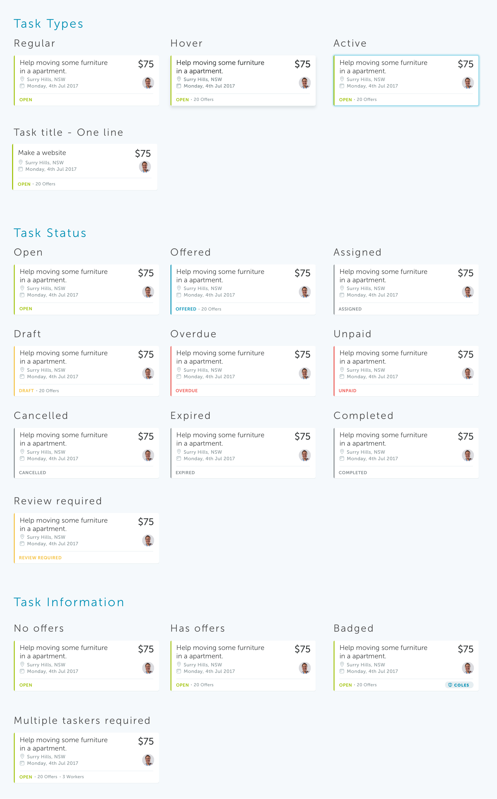
All task states
Solution
Show the full task title
Show the due date
Make sure badged tasks are clearly displayed
Update UI to match the current styleguide
Less emphasis on avatar
Colour code tasks to help Taskers easily distinguish the state of their task